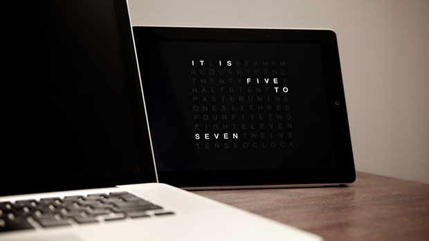
If you spent all your money on an iPad and can’t afford buying the amazing QlockTwo wall clock or watch, this app might just be the thing for you (in case you were planning on using your iPad or iPhone solely for the majestic purpose of reading the time in sentences). At just one dollar you get all the benefits of the QlockTwo without the drawbacks of its price (and render the gadget unusable otherwise, but hey – time in words!)
The app aims to redefine how we perceive and interact with time, offering users a visually striking and intuitive way of telling time. This transformation from a physical clock to a mobile app demonstrates the versatility of the QlockTwo brand and its commitment to bridging the gap between functional design and modern technology.
Table of Contents
A Unique Approach to Time Display
The QlockTwo app, like its iconic physical counterparts, displays time through a grid of illuminated letters, allowing users to “read” the time as if it were written in words. Instead of traditional numerical clocks, the app’s design spells out the time in phrases like “It’s half past two” or “Quarter to five.” This approach to time-telling is more artistic than functional at first glance, but it’s this exact combination of form and function that has captured the attention of design-conscious individuals. By swapping out numbers with words, QlockTwo adds a sense of playfulness and creativity to what would otherwise be a mundane task—checking the time.
The app’s design features a fluid, seamless interface that enhances the user experience. It’s not just about telling time; it’s about appreciating the passage of time itself. The subtle animations that transition between the words also give the app a dynamic quality, ensuring that it never feels static. As with its physical counterpart, the mobile app’s visual appeal is a central selling point. Whether it’s the soft glowing effect of the letters or the warm, inviting colors that can be customized by the user, QlockTwo makes telling the time an aesthetic experience.
Customization and User Experience
One of the standout features of the QlockTwo app is its level of customization. Recognizing that users have varied tastes and preferences, the app allows extensive options to personalize the display. Users can adjust the color of the text and background, choose different font styles, or even select from several time formats. Whether someone prefers a minimalist, monochrome look or a more vibrant and colorful interface, the app adapts to fit the user’s personal aesthetic.
Beyond the visual customization, the app also lets users select between different time modes, such as 12-hour or 24-hour formats, and even adjust the size of the display for better readability. These personalized settings make the QlockTwo app versatile enough for various scenarios—whether you’re using it as a bedside clock, a feature on your home screen, or as a decorative widget on your smartphone.
For users who prioritize functionality alongside aesthetics, QlockTwo also offers sound options to accompany the visual display. The ticking of the clock or a soft chime can add an extra layer of immersion, making the experience feel more grounded in reality. The flexibility in sound options ensures that the app can fit seamlessly into any environment, whether it’s the quiet solitude of a library or the dynamic atmosphere of a bustling cafe.
A Practical Application for the Modern User
While the QlockTwo app’s primary focus is on design and innovation, it doesn’t shy away from practicality. For many users, a clock is not just a decorative piece, but a tool that helps manage daily routines and responsibilities. With this in mind, the QlockTwo app integrates several practical features that enhance its utility. It’s not merely a showpiece on your screen; it also functions as a reliable timekeeping tool.
For example, the app includes a “night mode,” where the brightness of the display adjusts automatically based on ambient light, ensuring that users are not disturbed by a glowing screen during the night. This feature is particularly useful for people who use their phones as bedside clocks, as it helps preserve sleep quality while still providing the time at a glance.
Another practical feature is the app’s integration with notifications. By linking the QlockTwo app to your phone’s notification system, users can receive reminders, alerts, or even news updates directly through the app’s interface. This turns the time display into a multi-functional tool, blending practicality with design in an unobtrusive and effective manner.
Expanding the Brand’s Digital Footprint
The introduction of the QlockTwo app marks an important milestone in the brand’s evolution, as it seeks to tap into the digital space and reach a wider audience. Originally known for its iconic physical clocks, the transition to mobile technology allows QlockTwo to stay relevant in an increasingly digital world. The app serves as a natural extension of the brand’s philosophy, offering users an innovative and creative way to engage with time.
Moving forward, QlockTwo may look to expand its offerings, possibly by integrating the app with other smart devices such as smartwatches or even home automation systems. The potential for future updates and features is vast, as the demand for interactive, customizable, and functional design continues to grow. Given the success of the QlockTwo app thus far, there’s little doubt that the brand will continue to push the boundaries of what a clock can be.
There’s also an Android version, assuming not everybody is an Apple person. *whistle*
